
Automated Communication in Education
I hate contacting parents. As a former chemistry teacher, I wanted parents or guardians to be informed of how their student did in class, but parent contact was a task that I completely loathed. If ten students missed an assignment, a teacher would have to input a grade, select their ten parents, then write up and send a generic message. For every. single. assignment.
The purpose of parent contact is to keep parents informed of their student's progress. Now there's value in cultivating positive relationships with parents through personalized messages, but most of the messages that I needed to send were purely informational: notifying them of an upcoming quiz or test, reminding them of my tutoring hours, or updating them on what their students were learning. The task of contacting parents was not difficult, but I often wondered if there was a more efficient to communicate student progress.
After overhearing numerous venting sessions, I found that my co-workers also expressed frustration in how repetitive informing parents was. A teacher's time is precious and it's not worth spending it on tasks that can easily be done automatically. So, I set out to design a platform that would make contacting parents easier for teachers.
Problem
Interviews
I personally had problems with how tedious the current workflow was to contact parents, but I needed to make sure other teachers had similar experiences. To identify pain points and understand existing workflows of teachers, I created and asked some of the following questions:
A student fails or misses an assignment. Describe how you would notify their parent/guardian.
What functionalities/features do you like the most/least about the current system you use to contact parents/guardians?
What takes the longest time when communicating with parents/guardians?
I then conducted interviews with five of my colleagues and recorded them to synthesize similarities between their responses.
Synthesis
After the interviews, I sat down to organize what my colleagues had shared with me to find patterns in their experiences. First, I wrote down the responses of each person I interviewed on sticky notes. Based on the question and the answer, I grouped the notes by question and by similar response.


After grouping common responses together, I was able to clearly see what problems I wanted to address. The common issue all five interviewees had with parent-teacher communication was clear:
Contacting parents is tedious.
Here were some of the results I discovered from the interviews:
4 out of 5 people expressed that their biggest pain point was having to repeatedly contact parents.
2 out of 5 people praised the automated notifications of the current system, but wanted customization on the teacher's end.
3 out of 5 people expressed that they spent at least 2 hours contacting parents every week.
Based on these results, I concluded that automated communication with parents was a worthwhile project to pursue and sought to explore who and how my design would help teachers save time and stay connected with parents.
Research
Job Stories
Next, I created job stories based on the Jobs to be Done framework. This allowed me to explore different contexts in which a user would use this website and to understand possible situations, genuine motivations, and ideal outcomes of the users.
User #1:
When I communicate with parents,
I want my grade book to automatically contact them when a student misses an assignment,
so that parents can stay informed and support their student.
User #2:
When a student fails or misses an assignment,
I want their parent to automatically be contacted,
so that I can use that time to be more productive in other areas.
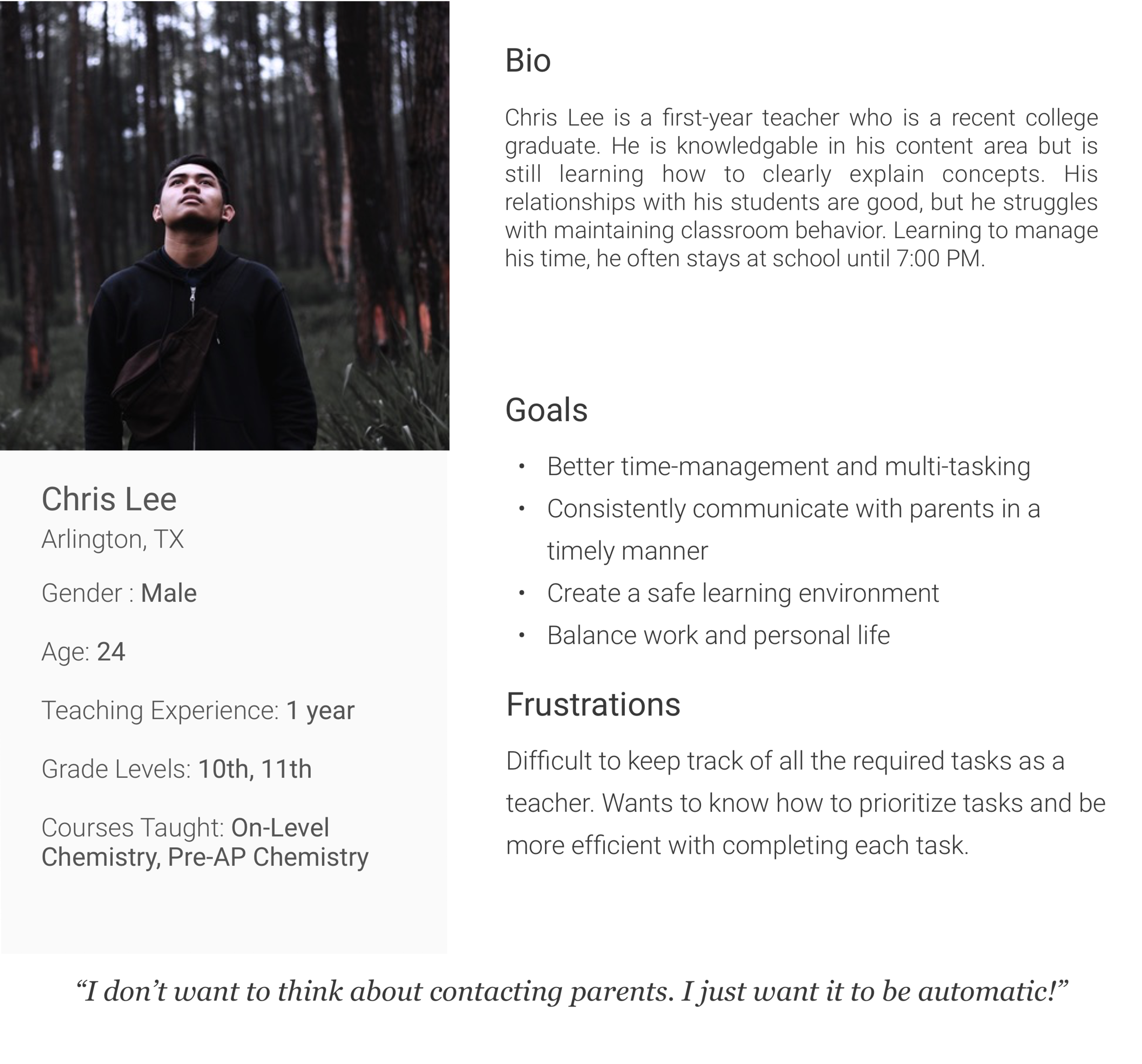
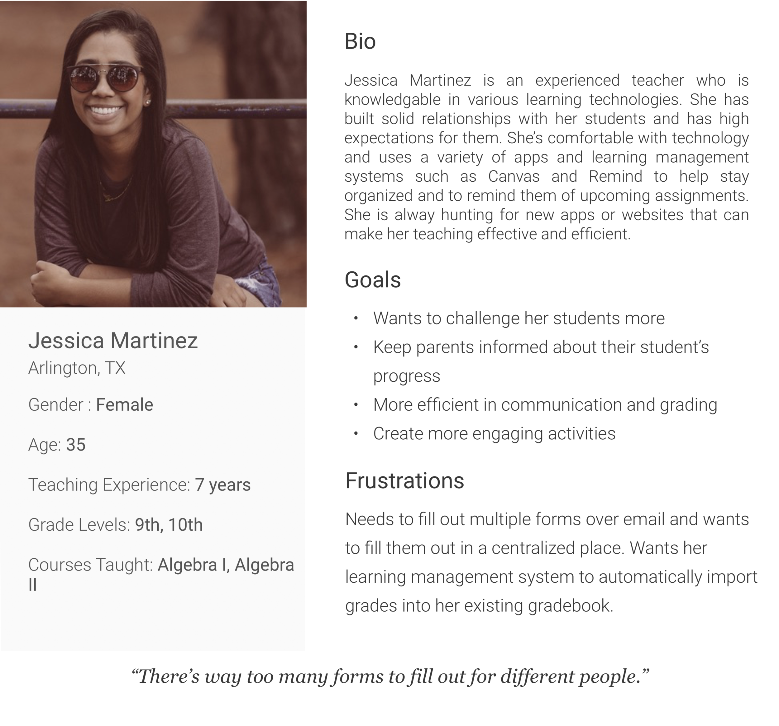
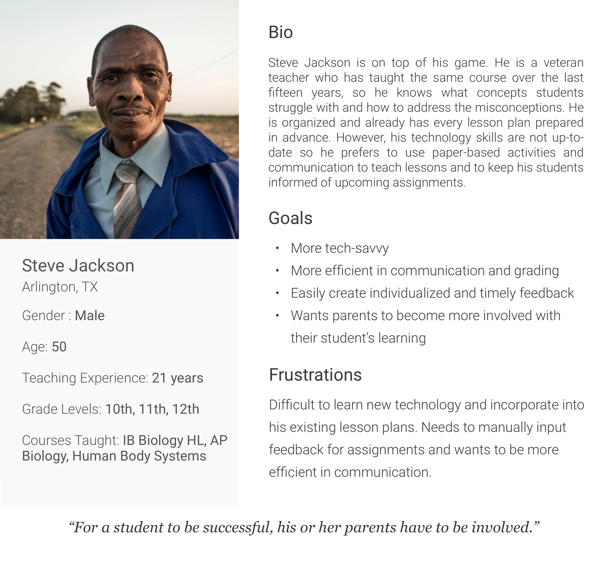
Personas
To focus on manageable users, personas were also developed based on observations of the teachers I interviewed. These characterizations guided my design for specific users and their needs, rather than a generic audience. They represented the types of teachers that I expected to use my design as well.
Ideate
User Flow
Before sketching wireframes, I mapped out user flows to understand how my system would interact with user behavior and the different screens and tasks users would have to navigate through. For comparison, I also mapped out the user flow of the existing system that my school district uses.
Existing User Flow:

New User Flow:

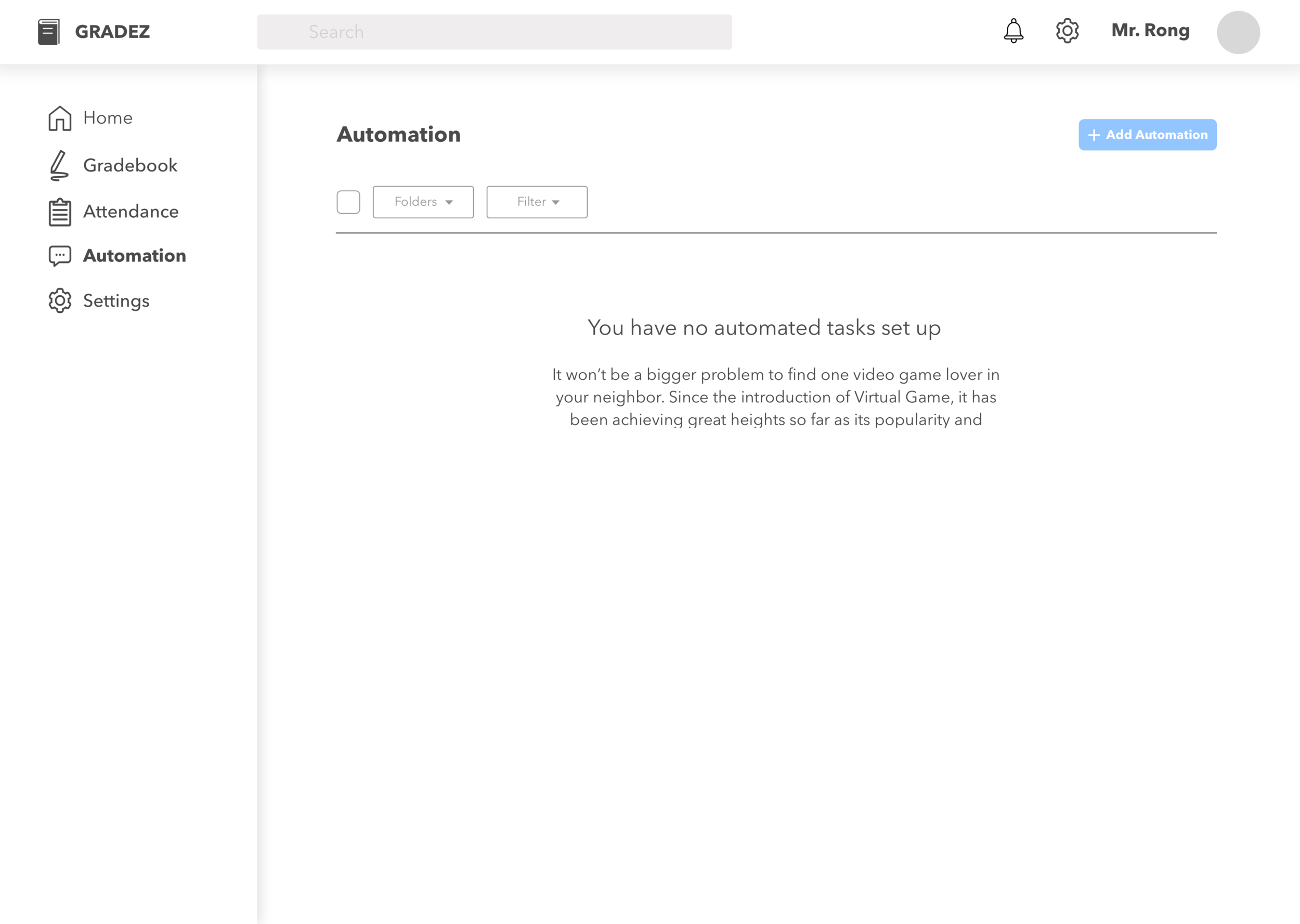
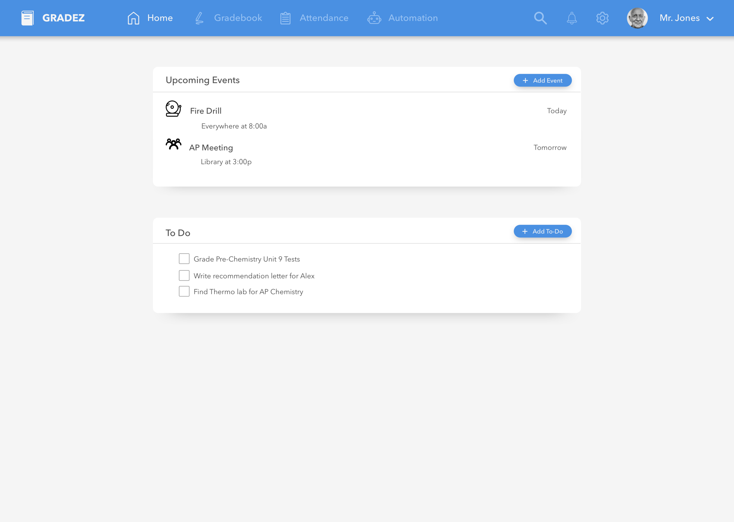
The main priority of this project was to create a more efficient experience for teachers so they would not have to repeatedly repeat the task of contacting parents. The existing user flow requires repeated contact with parents, whereas the new user flow helps to eliminate the need for having to actively contact parents for every missing assignment.
Wireframes
Sketching and storyboarding, I generated ideas about the arrangement of UI, elements, and interactive behaviors. With each sketch, the layout of the system became more tangible.

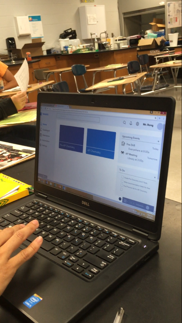
Prototype
Low Fidelity
Using the wireframes, I began to create low-fidelity prototypes using Sketch. I asked my colleagues for feedback to design a higher-fidelity prototype. Here were some of the suggestions I received:
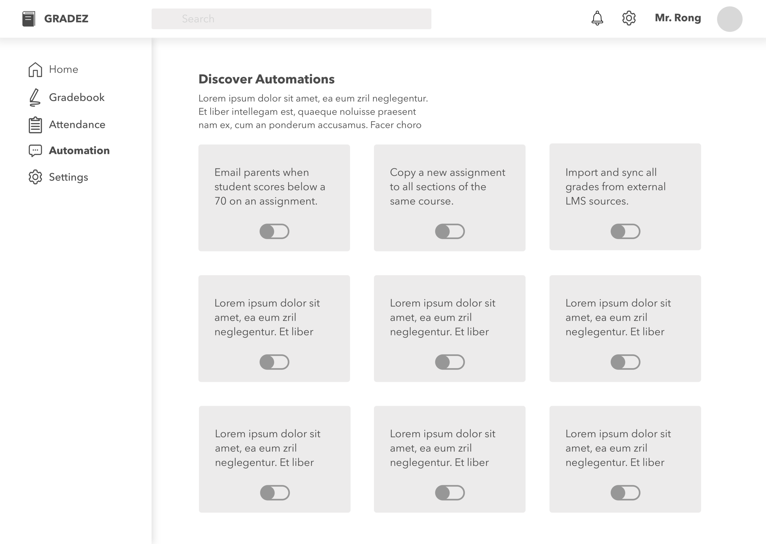
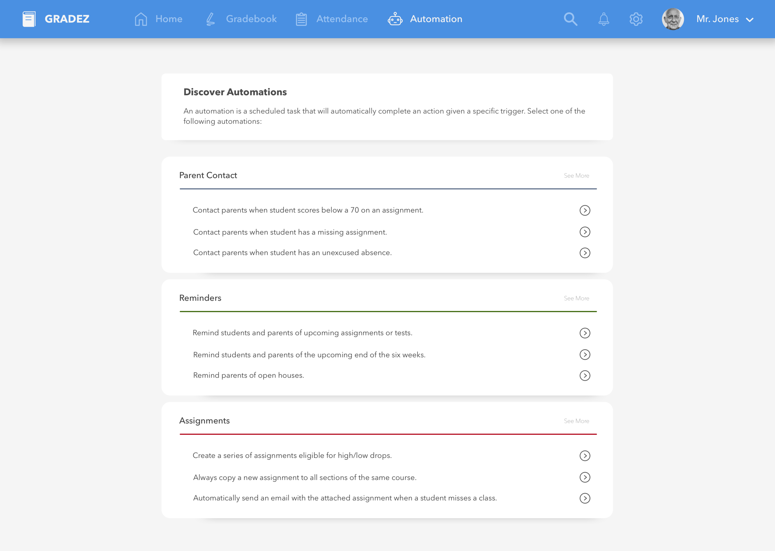
It was hard to locate relevant tasks in the "Explore Automations" page.
Too many options were displayed at once when creating the automated task.
Font was too big.
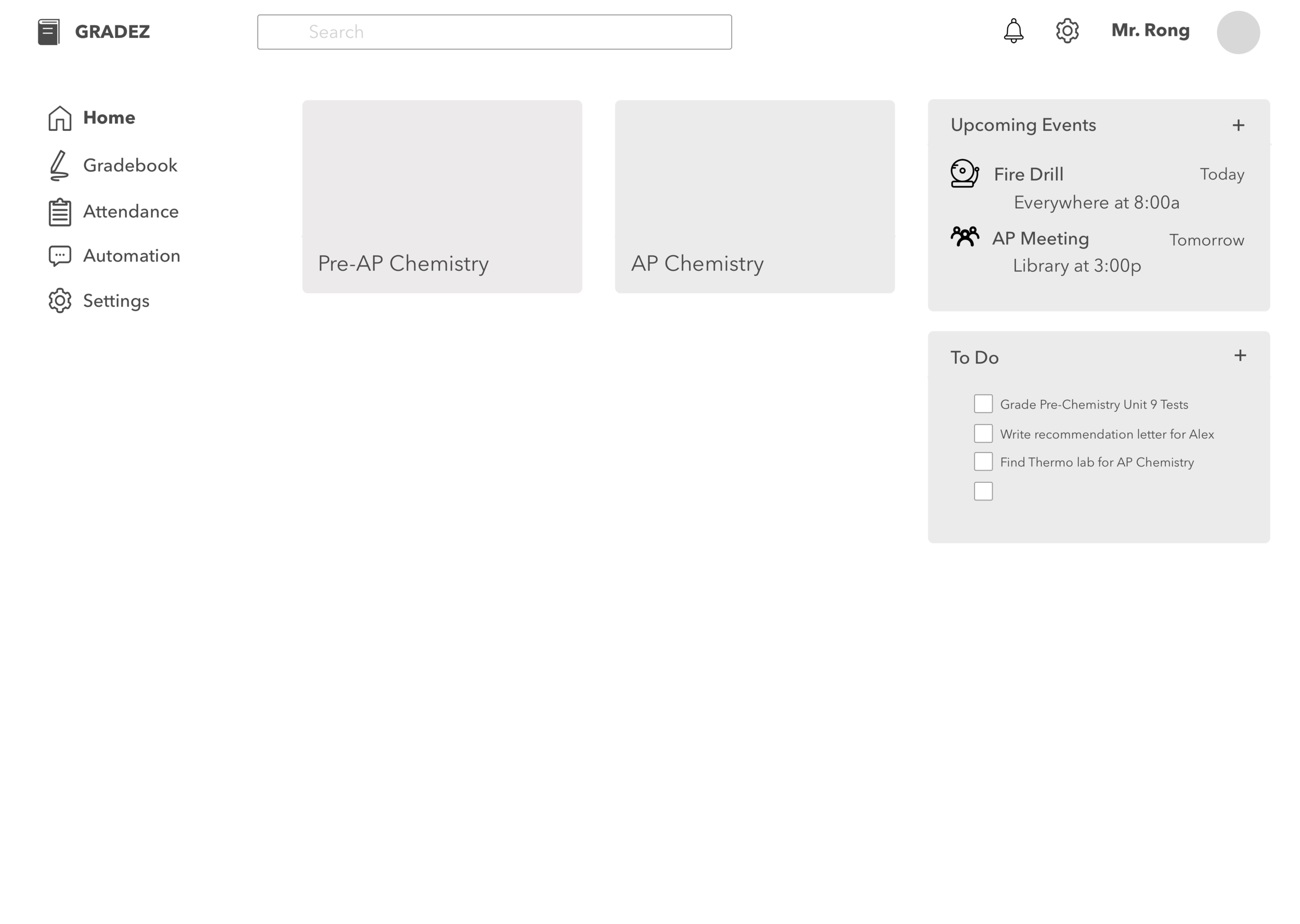
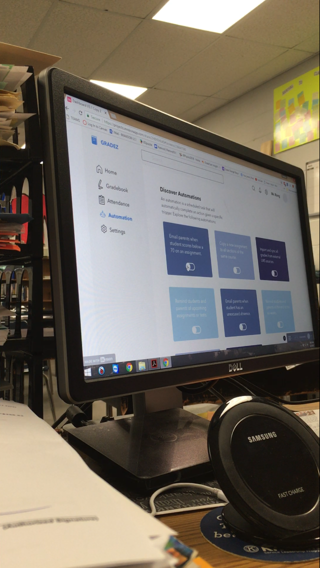
High Fidelity
After hearing feedback on my lo-fi prototypes, I refined the interface and added more details to prepare it for usability testing.
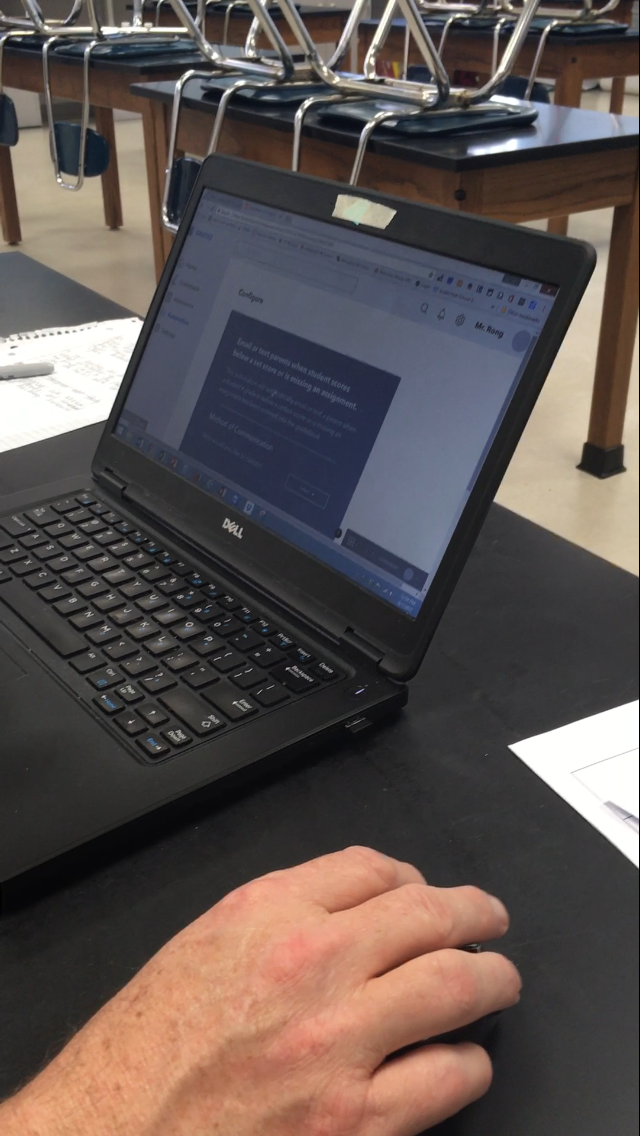
Test
Usability
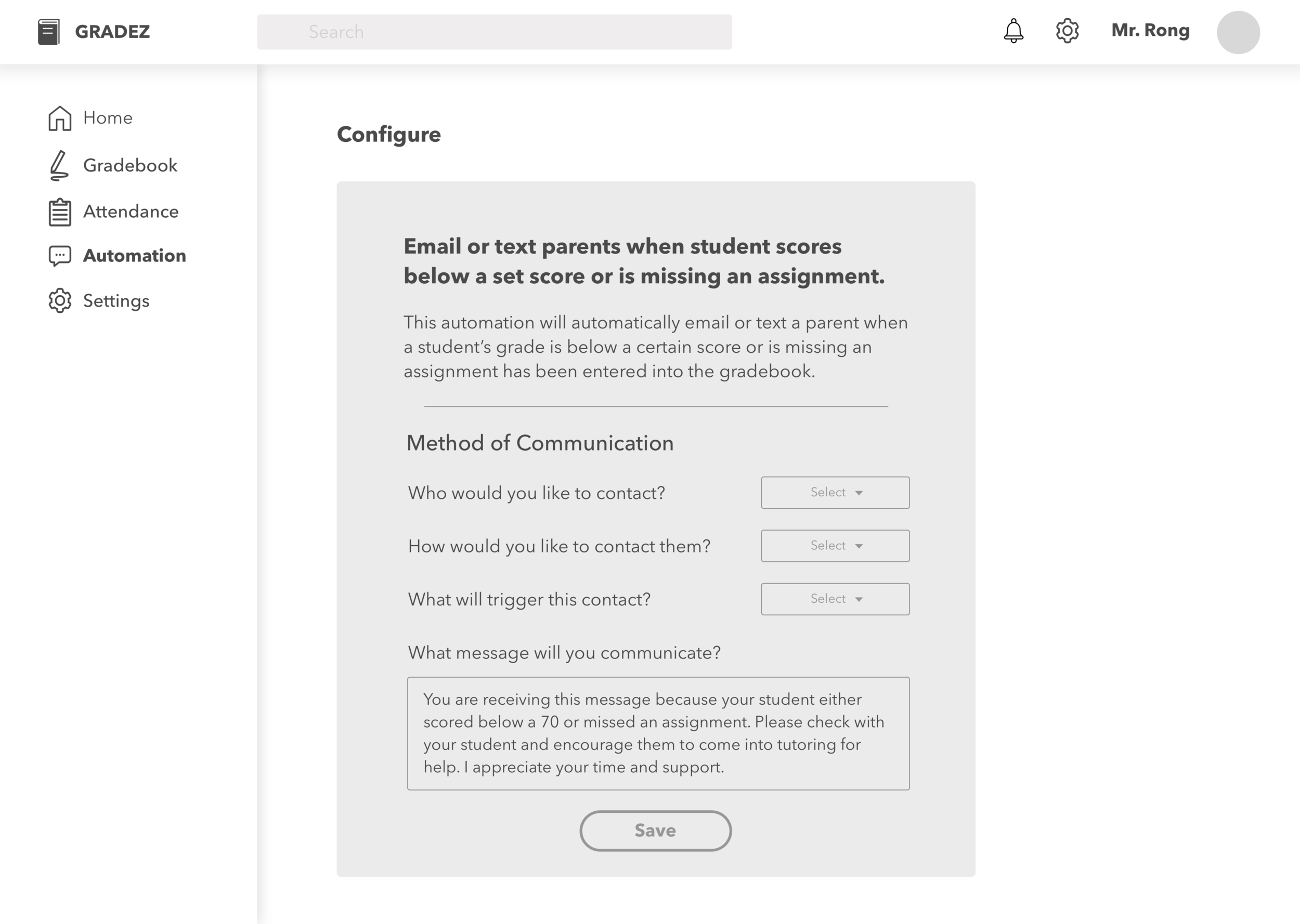
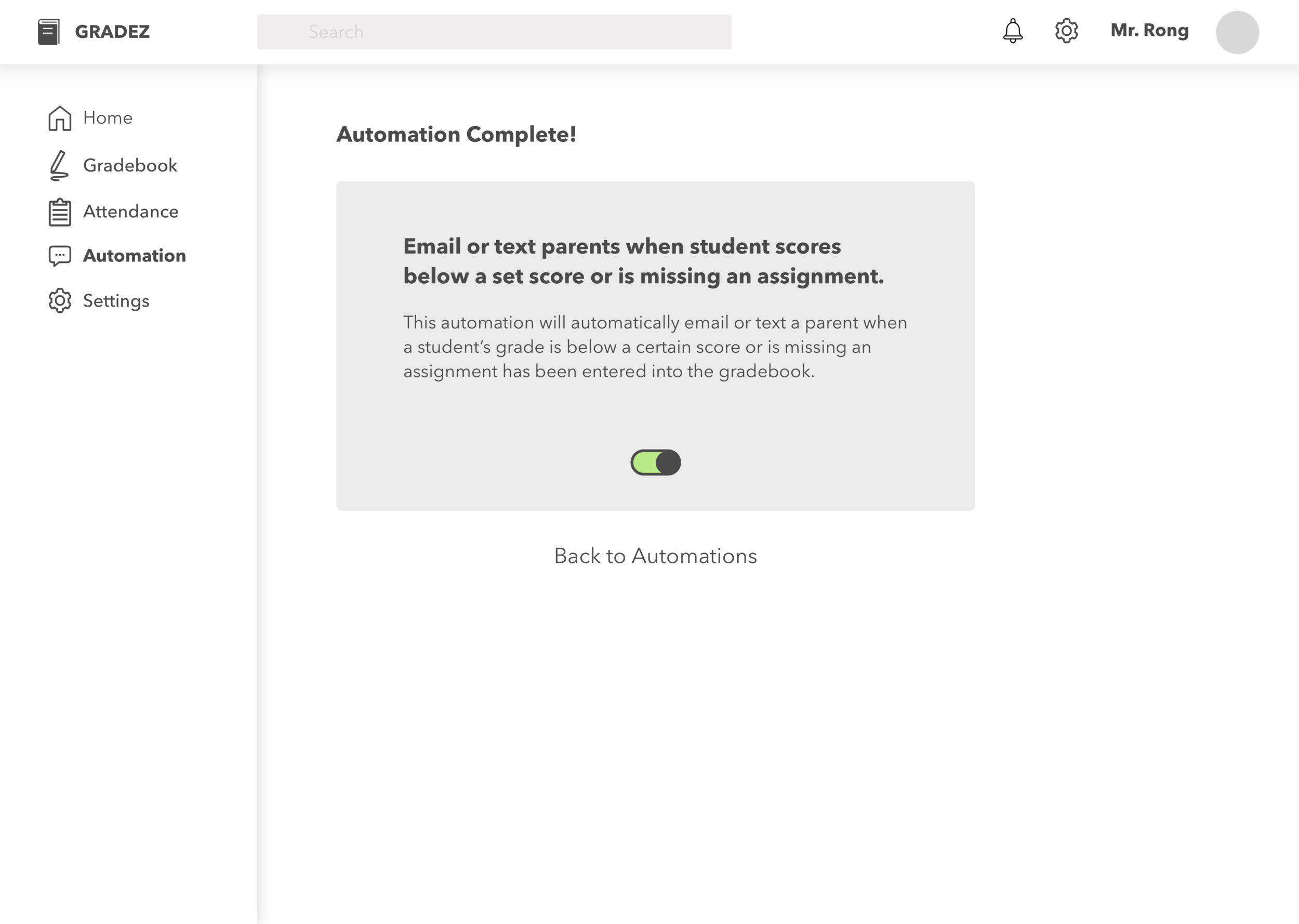
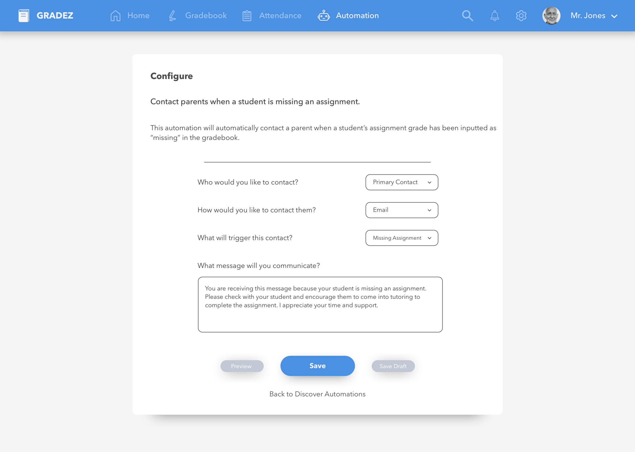
I asked five different colleagues to complete a task using the live prototype that I designed with InVision: set up an automated task that will message parents when their student misses an assignment. While they were testing, some users asked, "Should I click this?" but I wanted to see if the user would be able to figure it out based on the UI. Instead, I asked them questions like:
How do you think that task would work?
Where would you most likely look to find how to do that task?
Where would you click in this case?
Validation
Then, I asked my colleagues to rate their experiences with a quick survey:
On a scale of 1-10, with 1 being completely disagree, and 10 being completely agree:
This software was easy to navigate.
I can easily and quickly create an automated task.
Using this software will make contacting parents much easier than before.
I would recommend this software to another colleague.
After all 5 colleagues had completed the survey, I analyzed the data and averaged the scores below:
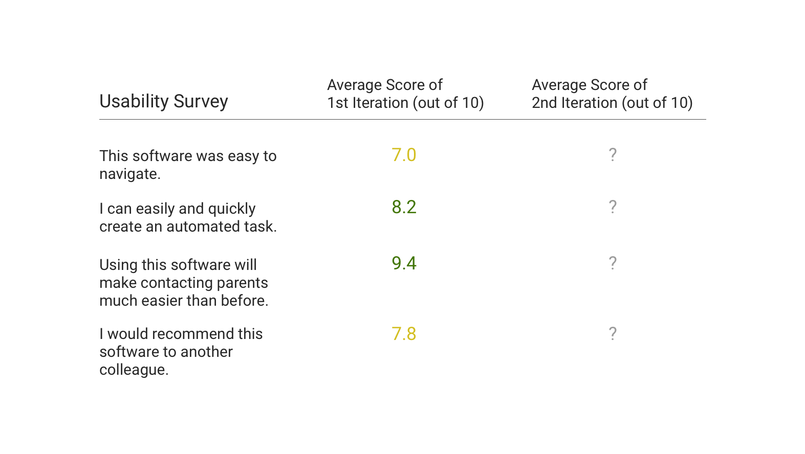
Based on the results of the survey, I concluded that the platform I created was fairly easy to use and that it was an improvement from the current workflow. Several of my colleagues were not able to easily navigate to the "Add Automation" screen, because there wasn't enough information on the dashboard/home screen.
If I were to perform more iterations of this project, I would focus on the following issues:
Design the flow of finding automations more intuitive.
Implement the "preview" and "save as draft" features.
Perform a thorough competitive analysis.
Overview
Time is the important resource that a teacher has, and it's often used up in countless of tasks. The goal of this case study was to implement a way to automatically contact parents, a task that teachers often dread. This project was just to scratch the surface of the potential of saving time for teachers and I hope to come back to it in the future!